


Bleacher Report rebrand & app redesign
When I joined Bleacher Report, my primary role was to lead the redesign of the popular Team Stream app, as well as assist in the complete brand refresh that was being done in-house. Despite some unconventional UX patterns of the app, it was incredibly functional, and had a cult-like following that kept users highly engaged.
There was a clear opportunity here to create a better sports app, that already had a winning formula behind it. On top of that, we would add a full-fledged social network, complete with a new brand and identity.
Company
Bleacher Report
Role
Sr. Visual/Product Designer
Goals
Overhaul and improve app UX & functionality
Grow app MAUs
Establish Bleacher Report as a go-to sports platform
Problems
👯♀️ Too hard to distinguish content from each other and feed
🤷♂️ App navigation is really awkward and non-intuitive
👀 Fonts/UI is difficult to read
👎 Wasn’t always clear that the “Team Stream” app was from
Bleacher Report
2016 Flashback: Make Bleacher Report Cool Again
Goals
🛠 Overhaul app user experience
🏆 Include features found in common sports apps
🗺 Build a foundation to support future roadmap and social strategies
👥 Grow app monthly active users (MAU)
🎯 Establish B/R as the go-to for Sports x Culture

My Role
App UX and Information Architecture
User Research / Usability Testing
Final Visual Design
Low / High fidelity prototypes
Style Guide and Design System
Icons and Illustrations
Company Swag
Team
3 x Product Designers (Including Me)
Design Director
PMs (App, Web, Growth, Data)
VP of Product
Executive Leadership
Discovery
Our Users

Ages 20 - 30
Follow B/R on Instagram
7 of 10 users not aware B/R had an app
Casual / Die Hard sports fans
iOS / Android
Mostly Male
Observations
Fans want a custom experience
Editing teams & interests made the app feel personal
Fans want to use just ONE sports app
All notifications are important, not just sports notifications
Too many notifications is a concern
Insights
Make ‘My Teams’ feel personalized
Need to make easy and intuitive to opt in/out of notifications
Fans didn’t expect new direction from B/R, but loved it
Icons with labels were preferred
We caught a lot of bugs!
Design
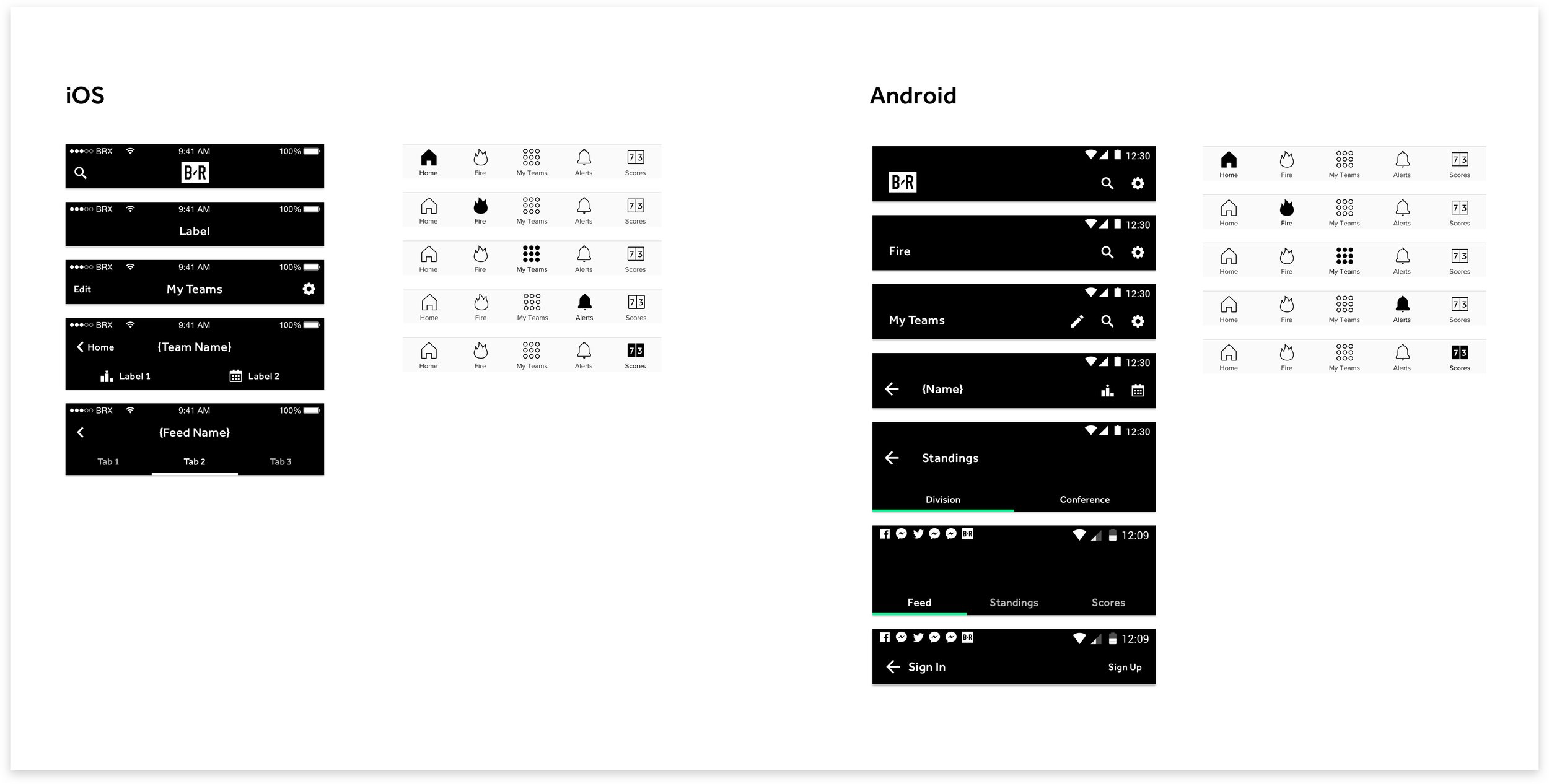
The navigation of the Team Stream app was oddly unique, in that the app opened on the ‘Home’ feed, and it didn’t have a typical nav bar at the bottom, making it difficult to navigate feeds. However, the focused intention was what sports fans wanted…access to teams, alerts, and scores, one tap away. As we approached redesigning the bottom navigation, this became a big sticking point. In our final design, we added the ‘Home’ and ‘Fire’ tabs to the bottom nav, along with My Teams, Alerts, and Scores, making each accessible within one tap.
Information Architecture & Navigation

Updated flow map

Detail of iOS Top Navigation Construction
Module & Feed Design


Icon explorations


Final Icons

Launch

The updated UI, combined with the new logo and branding really gave the app a whole new attitude and feeling. The refreshed look received lots of praise from the sports community, but most importantly, from our fans. The new logo was loved and it was appreciated that the app generally keep the same architecture, but made it much easier to navigate and find the content you wanted.
A new look & Feel

Home Feed
The Home feed is the most important feed in the app, since it is what our fans open the app to. Since all other feeds in the app are catered to a specific team or league, they aren’t really personalized. The Home feed on the other hand, is a mixture of content you have selected to follow, along with trending B/R content.
It was important that we made it easy to jump into a team feed from wherever you are in the app, since our data showed that users were more likely to retain when they follow 6 or more feeds. This helped us achieve our KPIs of app usage and feeds followed.

My Teams Controller
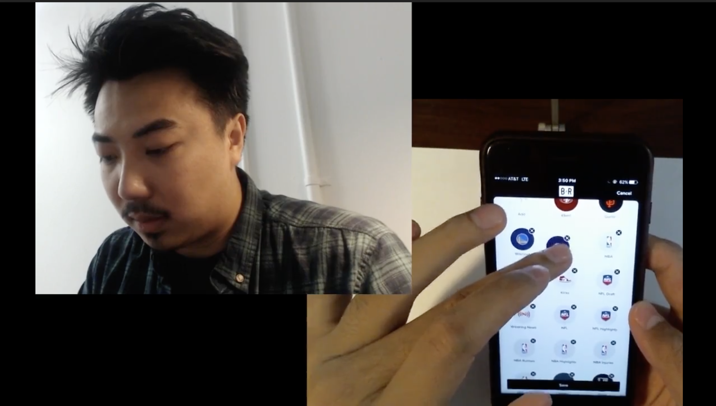
One of the fan-favorite features of the app, the “controller” as we called it internally allowed you to switch feeds, or “channels” within one tap, from anywhere in the app. This was a great way to make it easier for fans to find the content the wanted, and to personalize their app experience. I designed the tab to feel like a TV remote, where you can tap to jump to your team’s firehose of content.

Module & Feed Design
About 80% of the app UI is modules and feeds, so it was crucial that we made them easy to follow, and great to look at. Getting the content larger and more prominent was a main goal here, as well as overall feed organization.

Illustrations


Design System

In addition to the product and rebrand work, I also created the very first style guide and design system for the app and website. This would later become a big focus of mine, and you can read more about that project here.
Results
Impact
In April 2017, the re-vamped B/R app went live in the iOS app store and Google Play store. Since launch, here are some of the impact we were able to drive with the rebrand and redesign:
Top ranking in the ‘Sports’ category of the both app stores
+10% growth in Monthly active users since the launch of the redesign
+7% growth in organic installs
+3% increase in 30 day retention
5.12 app MAUs (Up from 3.5M at launch)
Achievements
The app and website have also been awarded consecutive Webby Awards for Best Sports App/Website since launching.
