Building Design Systems
As a product designer with over 12 years of experience, I have a strong track record of success in building and maintaining design systems from the ground up. I have led globally distributed teams, created governance and component prioritization models, and partnered with engineers to test and implement newly designed components and styles. I have also introduced new tooling to create efficient workflows and processes, and have a strong ability to create and maintain detailed documentation. My experience has given me a unique skillset and the ability to take on complex projects and see them through to completion.
Company
SmartNews, Bleacher Report
Roles
Sr. Product Designer, Lead Product Designer
Goal
To create a system of design guidelines and rules to be the source of truth for designers, developers, product team members, and increase engineering velocity.
Bleacher report
Background
As we neared completion of the Bleacher Report App Redesign, designers and developers were only using a basic style guide to keep track of new styles being created and used throughout designs. Realizing that a style guide would not suffice as our design team and app scaled, I proposed the idea of creating a design system to product leadership. I volunteered to take lead of the system, and partnered with a lead engineer to begin building it.
Problems
Basic style guide was not enough to maintain consistency as our design team scaled
Shipping velocity was stagnant as components were not being reused and being created from scratch each time
Design debt was mounting as we neared completion of our app redesign
Basic style guide that was used to begin app redesign initiative
Goals
Create a system that would scale with our rapidly growing design team
Increase engineering shipping velocity
Create a visual language that would be a foundation for future features and products, such as social, video, betting, etc.
Challenges
Lead designer for app redesign as well as design system
Not all team members understood purpose and reason for a design system
Accrued design debt as a result of only using style guide to begin app redesign
Design
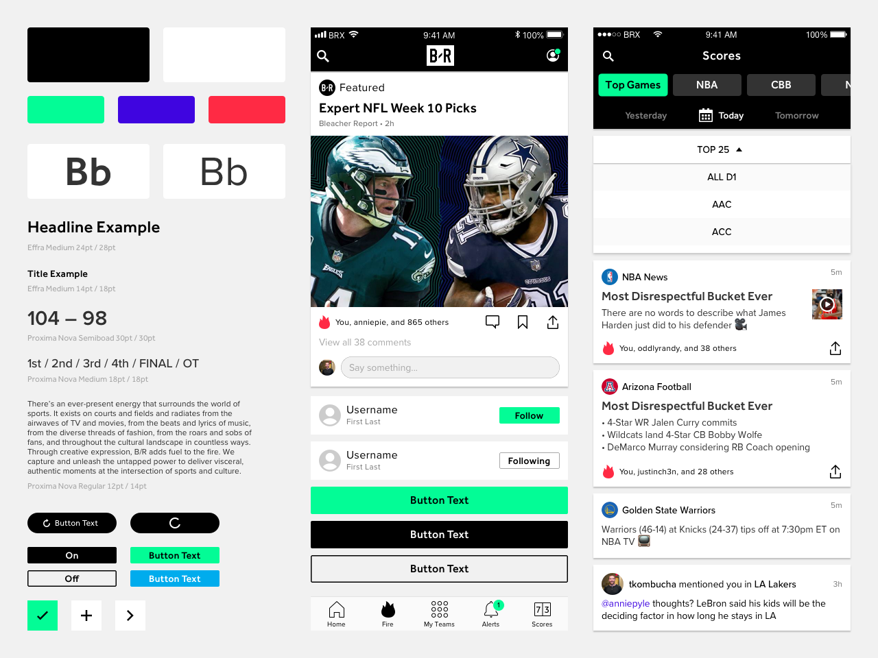
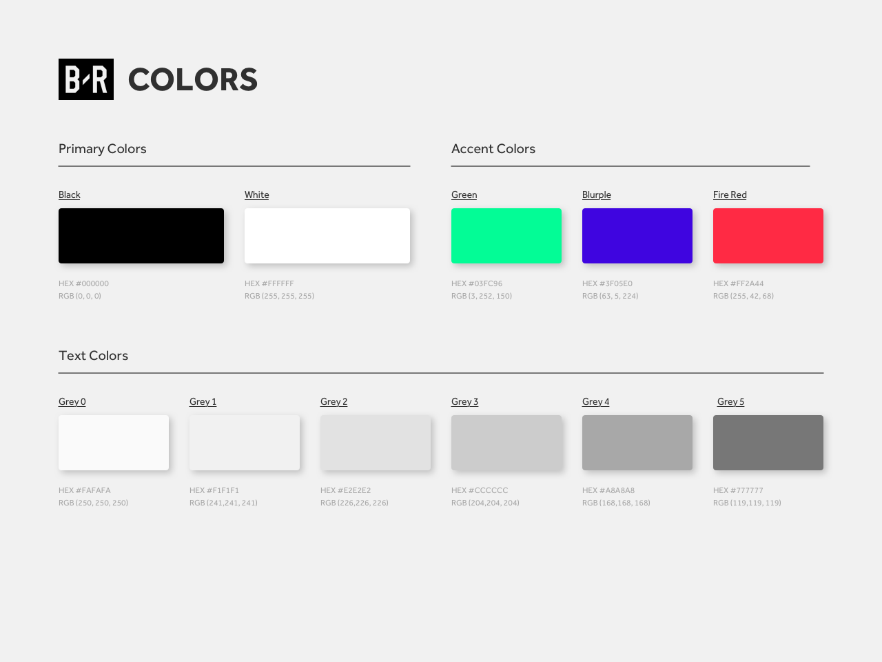
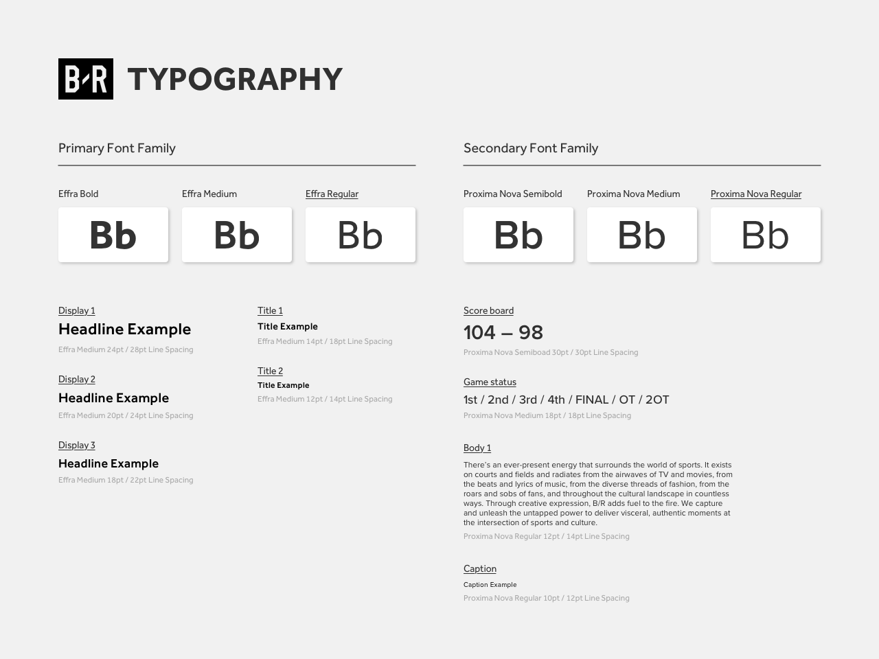
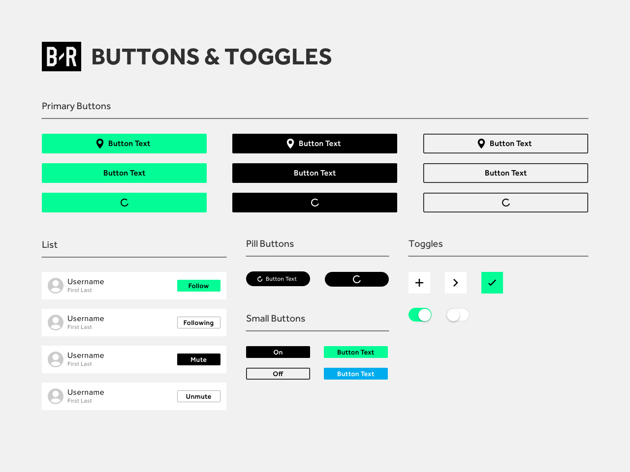
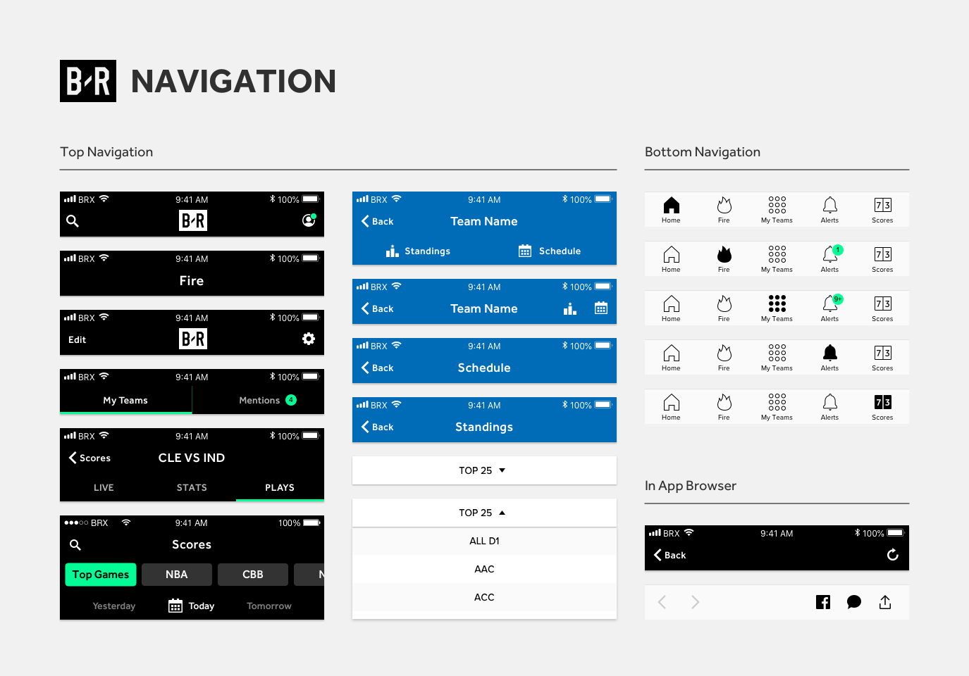
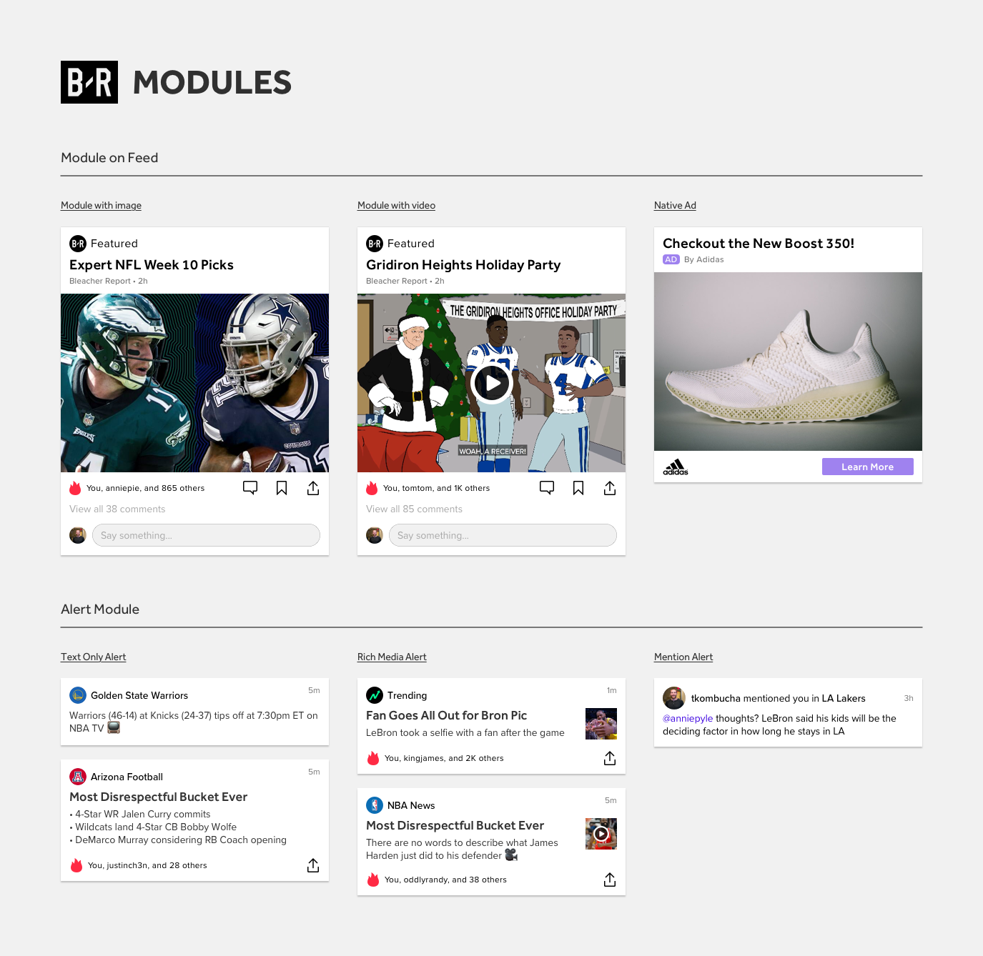
I evangelized to product leadership about the importance of building a scalable component library based on atomic design, rather than just a style guide. After partnering with the lead engineer to begin building the library from scratch, we were able to build over 300 components. These components became the foundation for the design team to scale their work and kept the UI cohesive. The design system went through multiple iterations over the next three years and I was responsible for creating, managing, and governing it. Additionally, I created a wireframe version of the design system in order to increase the velocity of early-stage design concepts and products.
Impact
Creating the design system was critical in allowing our team to scale while continuing to build new features that didn’t deviate from the new UI in the app redesign. It also allowed us to begin shipping new designs at a much faster rate, and with fewer errors and inconsistencies across different squads.
Created a foundation to build several new experiences and features
Shipped designs with minimal UI inconsistencies
Reduced time for new designers to ship UI by average of 5 days
Increased engineering shipping velocity by 30%
Transition design team from Sketch to Figma
Reflection
The BREGO design system was just the beginning of what had the potential to become a full-fledged design system with engineering support. New designers that joined the team praised the system in place as it allowed them to really understand the UI and hit the ground running. Engineers also loved the design system as it allowed them to reduce repetitive work, as well as work with other squads to share coded components and styles.
SmartNews
Background
While at SmartNews, I was part of the team tasked with creating a design system for our company's suite of products (US & JP apps, Brand, OOH). Our goal was to establish a consistent look and feel across all of our products, while also making it easy for designers to quickly and efficiently create new designs.
Problems
The design team was 4 team members when i joined, but quickly grew to 16+
Final designs were made using screenshots of production app
No source of truth across existing files
Every designer had a different method/process for creating designs and sharing them with devs
UI styles were not WCAG compliant
UI styling was not consistent across designs; varied by designer
US / JP apps were completely different in terms of styling, when they were supposed to be as close as possible
Actual Button Spec when I started
WCAG 2.0 Failure
Goals
Create a base component library for the team to use while we waited for proper resource allocation to build a design system the right way
Hire team of UX developers to support iOS / Android platforms
Partner with EMs, executive team, design leadership, VP of product to implement new processes and allocate back end engineering resources
Introduce new DesignOps tools such Zeplin to formalize dev handoff process and Zeroheight for design system documentation
Create dynamic set of design tokens
Achieve WCAG 2.0 AA compliancy
Challenges
Educating the org on benefits of building a design system
Hiring an all new team to help build
Proving value of DS, resourcing, processes to a global company that isnt familiar with DS
Building a DS in parallel with several squads building new UI/features
Building for JP/US editions of the app
EDS team distributed across 4 time zones (JP, CA, NYC, Ghana)
Discovery
We started by conducting a thorough audit of our existing design assets. This included reviewing our existing design guidelines, as well as analyzing the design patterns and styles that were being used across our different products.
Once we had a clear understanding of our current design landscape, we began the process of creating a design system that would unify our products. We started by defining a set of core design principles that would serve as the foundation for our system. These principles included concepts such as clarity, simplicity, and consistency.
New Component Decision Tree
Prioritization Matrix
Design
EDS Foundation (v1)
Impact
Created base component library for designers to build cohesive UI
Along with new design director hire, prioritized global design system
Created new squad dedicated to building the design system, as lead designer
Hired 2 UX engineers, worked with engineering managers to allocate back end engineering resources (4 time zones)
Built design system starting with foundational styles, refocusing on making them more accessible than production versions
Built over 2000 components across iOS/Android platforms, supporting light/dark mode (US only)
Tested components starting with foundational styles, article cell components (primary UI element)
Developed a robust governance model
Worked with lead UX engineer, design intern to create documentation for all components, styles, and brand related design guidelines
Introduced new tooling to aid in dev file handoff process (Zeplin, Zeroheight, Notion)
Worked with Tokyo-based designers to begin creating JP version of design system using the same framework
Documentation Site
Interactive Button Demo
Coded Components in Zeplin
reflection
Overall, the creation of our design system was a success. It allowed us to unify the look and feel of our products, while also providing a clear and consistent framework for designers to work within. This not only improved the aesthetic of the products, but also made the design process more efficient and streamlined. Unfortunately, my time at SmartNews ended due to a company wide re-org, and so I wasn’t able to see the the full transition of the new components. Nevetheless, I am proud of the work we did and how we setup up future teams to successfully build a cohesive UI across a global product.
Here are some highlights:
Created the first ever design system for SmartNews
Created supporting docs, presentations to entire company to build up to executive level buy-in
Formed a separate squad within the design team to solely focus on building, maintaining, and governing the design system
Started with defining principles and a component library framework that would allow us to scale as we grew
Initial tests showed minimal to no errors, which gave us the green light to deploy and ship the first component (Article Cell)
Achieved WCAG 2.0 AA compliancy for all UI text and colors


